Throughout 2022, the financial statements from tech companies were extensively discussed, and you probably have seen diagrams like this:
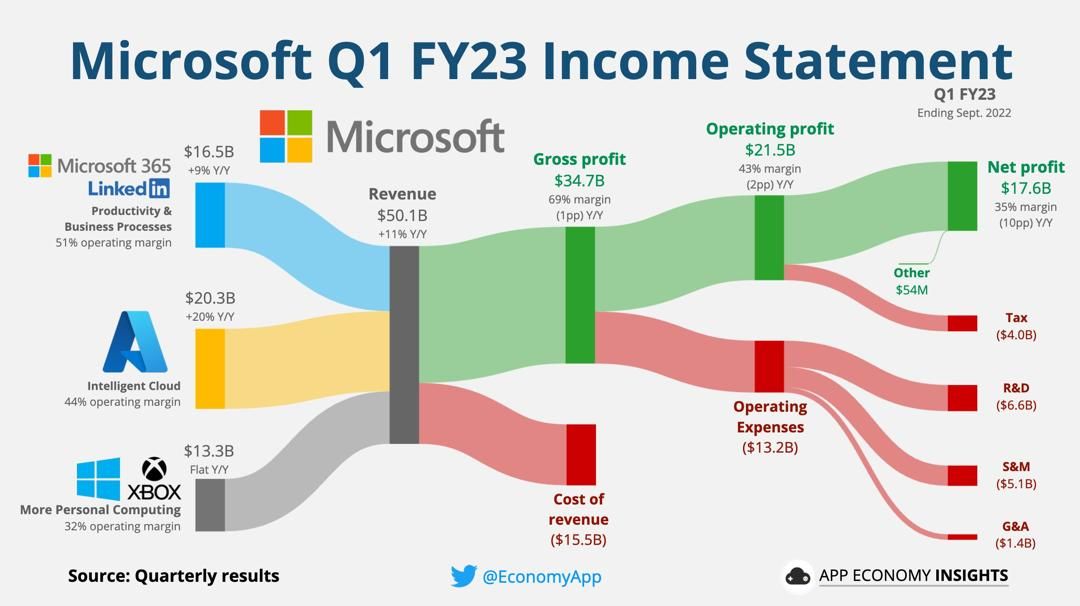
I later discovered that this diagram is known as Sankey Diagram, which is a type of flow diagram in which the width of the arrows is proportional to the flow rate of the depicted extensive property. The Sankey diagrams are often used in the visualization of material flow analysis. It can also visualize cost breakdowns.[1]
I’ve been using Intuit Mint to manage my finance, however I feel that the budget and trends feature is not good enough: The pie chart and histogram that Mint provides doesn’t provide enough insight, and its budget feature is limited, for example, it’s not good at managing expenses that happens once but covers an extensive period of time.
Since Sankey is designed for illustrating flows, it’s a perfect tool to visualize finance and cost, especially for people have multiple source of income, or need to manage the data in a larger scale, for example, for the entire family or their small business.
Luckily, Mint allows us to export transactions data to CSV files, therefore we can analyze the data in our way, and create our own diagrams.
I did some searching and found out a few projects on GitHub that provides this functionality. bradysalz/mint-sankey: generate Sankey diagrams from Mint budgets is a good one but it has some drawbacks that doesn’t meet my expectations:
- It haven’t been updated in 4 years, while Mint have updated their categories.
- The author introduced logic about pretax income, which I don’t need.
- It only supports one level of category.
- It needs to be run using Python in CLI
Therefore I did some improvements on top of bradysalz/mint-sankey project, and made it a web app.
Try it out here: Mint Sankey, a sample input data can be downloaded on the front page.
And checkout on GitHub: https://github.com/frankgx97/mintsankey
Getting started
To start using Mint Sankey, follow the steps:
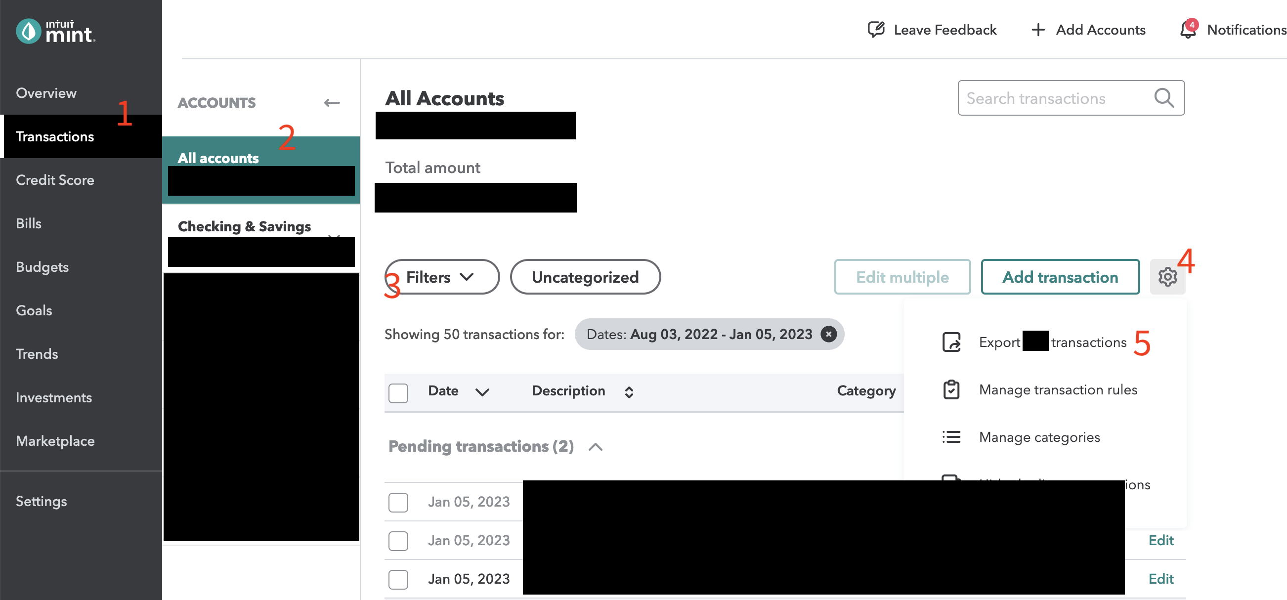
- Log in to Intuit Mint.
- Select “Transactions”.
- Select the accounts.
- Apply filters to filter transactions based on time or categories.
- Click the gear icon, then click “Export x transactions”, a CSV file will be exported.
- Go to Mint Sankey, upload the CSV file.
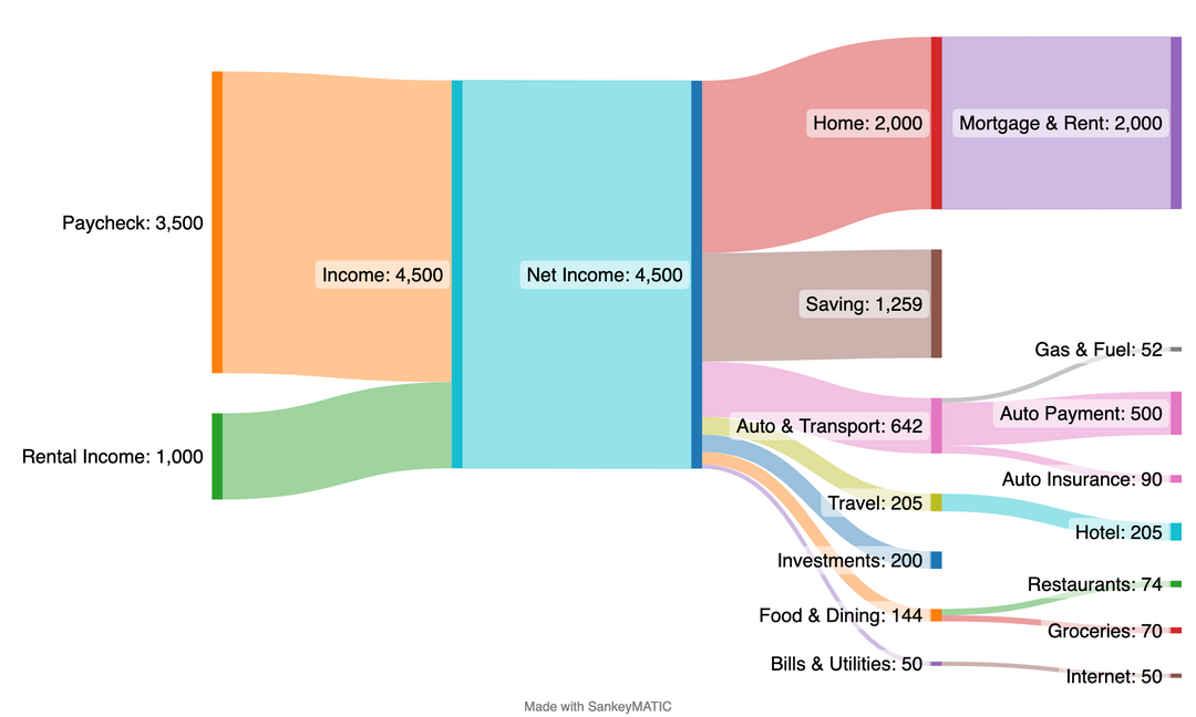
It generates three outputs: image, interactive HTML and SankeyMatic.
Image and interactive HTML are created using Plotly. It also generates text that can be used as input at SankeyMatic. We recommend this approach if you’d like to customize your diagram or manipulate the data.
Sample output:
Privacy
I understand that you may have privacy concern since it involves personal financial data. Your data will never be sent to 3rd party, and any data you uploaded and generated will be wiped hourly. Checkout the Privacy Policy to see how your data will be processed.
You are also welcome to run or deploy from source.
Contribute
Since I can’t gather enough test data for a comprehensive testing, it’s possible to encounter a corner case that cause the diagram to look funny or application to crash. Please feel free to create an Issue or Pull Request.

发表回复/Leave a Reply